The story of Transilvania Bank's brand identity. From the medieval logo to the logo with Romanian charm
September 16 September 2016 Reading time 7:00 minutes
In its 22-year history, The Transylvania Bank's brand identity has known three essential moments: the launch in 1994, the rebranding in 2003 and the one now, in 2016. Some untold stories so far, from people and teams directly involved in the essential moments of the stylization of the Banca Transilvania brand identity.
1994: The first logo of the Transylvania Bank: medieval concept, which spoke about Transylvania and the struggle for the affirmation of BT
After the establishment of Banca Transilvania in Cluj-Napoca, choosing a logo was among the priorities, so the founders wanted the entrepreneurial idea to take shape as soon as possible. The founders were looking for a person with talent, who would draw the logo as suggestive as possible: to be about Transylvania, the birthplace of the bank, as well as about the growth plan in that area, with which they identify in terms of values and even of the name.
From recommendation to recommendation, we reached the cluj architect Ioana Avram, with whom we had the opportunity to meet these days and who told us, with love, about the beginning stage of the Banca Transilvania logo: "I remember the fact that she drew the logo according to the suggestions of the top management of the bank at that time. There were several variants, some even more complex in design. The realization of the concept and the choice took about a month. It was chosen the logo that most suggestively renders the historical load related to Transylvania. The writing, the halberds and the shield in the logo – all of them, warrior elements, of medieval influence, specific to the Transylvanian area and its historical evolution – symbolized the struggle for the affirmation of the BT, which was to follow immediately after the launch, but also the tenacity of those who joined this struggle.
The first colors of the bank were black and yellow - gold. Ioana Avram also remembers: "The colors were not difficult to choose, especially since back then the possibilities of printing and using on different materials were less permissive than now. Black with yellow has always been a pleasant contrast, but also very suitable for the banking field. Yellow suggested, in fact, the gold that the little bank of that time, Banca Transilvania, was going to produce and manage.
This brand identity accompanied Banca Transilvania for 9 years.
2003: The first BT rebranding – contemporary and minimalist concept
The first rebranding in the history of BT took place in January 2003: the moment coincided with a new stage in the history of Banca Transilvania. Basically, BT was starting its expansion offensive nationwide, and the new brand image expresses precisely this reinvention of the bank and its new vision. BT collaborated with an international team of architects, from the company SL & A International – Romania, which proposed several dozen variants for the new BT logo, all keeping the graphic idea of the shield, from the first logo of the bank. As a curiosity, they tried versions with yellow and blue, after which the idea of chromatics in the first logo of the bank, yellow and black, was returned.
A meeting, in Cluj-Napoca, at BT, between a part of the top management of BT and the representatives of SL & A International led to the final shape of the logo. Sketched by the bank's representatives, the new logo was graphically transposed by SL & A International. The bank is still keeping this manuscript. "The concept of the new BT logo has been part of a contemporary and minimalist design. The logo was simplified by the lines used and by the font of the letters. The composition included a detail of novelty, two horizontal lines - yellow and black - which signify, for the bank, contentity, and in the design it was an element of balance" recalls Brandon Lee, Creative Director in the then team of SL & A International – Romania.
The realization of the logo and the first Concept Book of the bank took only two and a half months. The launch of the new BT brand identity took place on January 13, 2003, in Bucharest, at the Hilton Hotel, during a press conference and, subsequently, during a festive meeting with clients and partners of the bank. Victoria – Bucharest Agency, BT headquarters number 46 at that time, was the first headquarters of the bank included in the new brand concept, a concept that was to be replicated in all over 500 locations later opened by the bank.
2006: Brand identity stylization & visual and verbal identity manuals for the whole BT family of brands
Adjustments to BT's brand identity were made 10 years ago, in 2006, by Grapefruit, one of the well-known branding agencies. For 18 months, work was done on visual and verbal identity textbooks for the entire BT family of brands, a family that had grown strongly during that time.
Marius Ursache, founder of Grapefruit, told us the following, from San Francisco: "I still remember the first meeting with Banca Transilvania, in Iasi, in the small hall on the ground floor of grapefruit headquarters. We took care to invite the two guests from marketing & PR on the only two rotating armchairs that were still safe, and my colleague Stefan and I sat on the armchairs with the faulty mechanism, trying – successfully – to keep our balance for half an hour. I know we looked together at some Branding Manuals that Grapefruit had already worked on. After a few weeks we started working on a project that has become one of the most complex – if not the most complex – branding project in Grapefruit history: redrawing, finetuning banca Transilvania identity and creating a set of identity manuals with all visual and verbal identity applications, not only for the bank, but also for all its sub-brands, and some of them would be: BT Café, BT Tennis Cup, BT Academy, BT Cross, BT Golf Cup, BT Leasing, BT Asset Management, etc."
Marius Ursache (logo tuning, drawing new font, general design lines), Adrian Mititelu (material design), Iulian Avasiloaia (material design) and Gabriel Pogor (identity manual design) formed the team that brought its contribution to this stage in the history of the BT logo. "Now, after ten years, I realize that not only a very nice project has fallen behind, but also friends with some special people, who put their soul in the project" , added Marius Ursache.
The second BT logo was part of the transylvania bank story for 13 years: a successful period, in which BT became one of the largest banks in Romania – and even in Europe – and developed as a financial group.
2016: The second rebranding of BT – modern concept, with emphasis on the bank's nationality and Romanian values
The year 2015 brought the idea of the second BT rebranding, Banca Transilvania being in a new stage of development, of maturation, which supports with respect, passion and new ideas the Romanian entrepreneurial spirit.
Almost a year took the steps to propose the new BT brand identity: audit, redrawing, brand strategy and communication, respectively launching on September 15th this year. The rebranding project was carried out in collaboration with Brandient, a Romanian company dedicated to consulting in strategy and brand design.
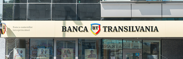
The new stage in the design of the brand identity emphasizes the "nationality" of the bank and on the Romanian values, among which is the entrepreneurial spirit. The new logo comes, more than ever, with a rich palette of colors – yellow, red and blue – which represents, from now on, the new visual language of The Transylvania Bank. BT has kept the elements that have brought it visibility, favorability and sympathy so far: the shield – as a graphic element, the yellow BT and the Fairy – a character that gives the bank's communication uniqueness and an original way of transmitting information. Also, the bank's positioning remains the Bank of entrepreneurial people: 1 out of 3 entrepreneurs who start a business choose BT.
This is the story of The Transylvania Bank's brand identity. At first, with medieval charm, and later stylized and talking about the nationality of the bank and national values. Regardless of the logo, BT has palayered the shield over the years, as a symbol of the protectionof the values in which it believes and which it appears.

Press contact
Other articles
18 APRIL 2022
A little more
I just sent an email to you. Confirm your subscription by clicking on the link in the email.


